Unveiling the Past: How Data Visualization Breathes Life into Historical Narratives
Imagine walking through a time capsule, where every artifact, every record, and every anecdote has a story to tell. In the digital age, that time capsule has transformed into a vibrant world of data visualization, turning historical records into engaging narratives that breathe life into the past. Historians and archaeologists alike recognize the power of this technology, as it crafts a compelling persona of history, allowing us to connect the dots between distant past events and our present moment. Data visualization is not simply a tool for representation; it's a bridge linking us to our cultural heritage, our shared memories, and the lessons we can glean from the stories of those who walked before us.
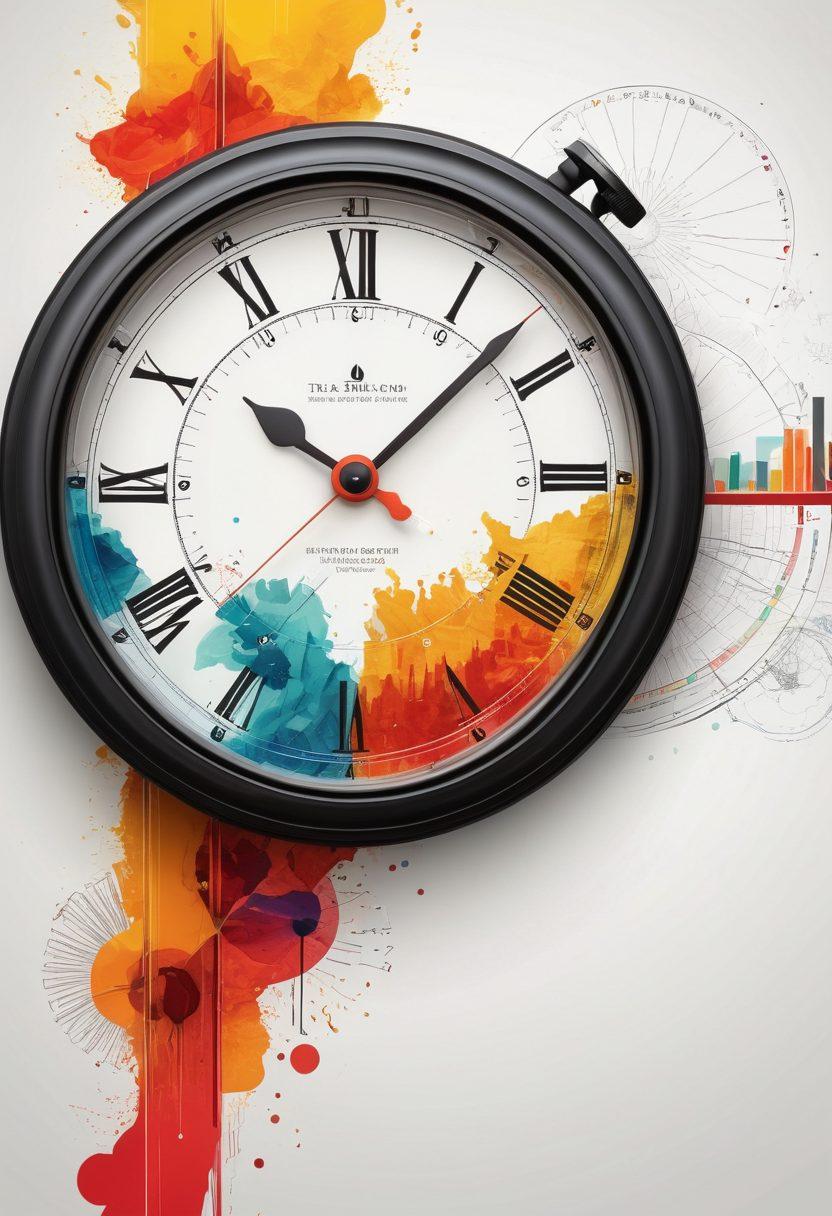
In the realm of historical analysis, data visualization stands out as an essential tool for translating complex historical timelines into easily digestible formats. Think about all the data historians gather: dates, events, figures. It can often feel overwhelming and abstract. However, through innovative techniques like histograms and timeline visualization, these records transform into clear and concise narratives that tell the story of human development. Imagine scrolling through an interactive timeline where you can easily navigate pivotal moments in history that have shaped civilizations. Such visualizations invite you to engage actively with the chronicles of humanity rather than passively consume disjointed facts.
For instance, consider a project that visually represents migration patterns over centuries. Wouldn't it be fascinating to see how these movements influenced cultural histories and shaped current populations? With the help of data visualization, historians can share insights not just through text but through compelling visual stories that resonate with audiences of all ages. It’s like watching a historical documentary unfold before your eyes, with charts emerging to illustrate trends, disparities, and the complexities of human experiences. The potential for creating educational experiences that are both informative and enchanting is limitless!
As we delve deeper into the role of data visualization in history, we must ponder: how can ordinary citizens engage with this medium? Understanding historical documentation doesn't have to be confined to the walls of museums or classrooms. Many organizations are harnessing the power of data visualization to educate the public. Local history centers may create visual campaigns highlighting their community’s heritage, sparking interest and encouraging residents to dig deeper into the chronicles of their surroundings. Perhaps you could embark on a personal project, documenting an aspect of your family history using data visualization. What a powerful way to make those memories come alive!
Ultimately, by unpacking the value of data visualization within historical narratives, we are reminded of its potential to connect people across time and space. When we view history as a rich tapestry woven from diverse threads—each representing different perspectives, experiences, and stories—we relish the opportunity to explore the intricate patterns that shape our identities. So the next time you encounter a histogram or a timeline visualization, remember that these are not just tools; they are gateways to understanding the human experience, inviting us to not only observe but actively participate in the historical narrative. After all, history is alive, waiting to be told!
From Time Capsules to Timelines: Exploring How Data Visualization Enhances Our Understanding of History
History is more than just dates and events; it’s a tapestry woven with memories, anecdotes, and the chronicles of the past. Imagine unearthing a time capsule whose treasures allow you to time-travel through different eras. How do we, as modern-day historians, navigate this treasure trove of information? That’s where data visualization steps in, transforming abstract historical data into vibrant narratives that not only enlighten us but also instill a sense of connection to our past. In this exploration, we’ll uncover how data visualization enhances our comprehension of history, creating a bridge between the past and our present consciousness.
Historical analysis often feels daunting. The sheer volume of records can be overwhelming, but what if we could turn this overwhelming data into something digestible and engaging? Enter the world of histogram graphs, timelines, and visual narratives. When we visualize data concerning past events or archaeological findings, we unlock the potential to understand historical events better, appreciating their complexities and nuances. As a famous historian once said, “History is a guide to navigation in perilous times.” Let’s unpack how visual tools help us not only navigate but also explore our cultural history more vividly than ever before.
Consider the concept of a historical timeline, a tool historians have utilized for generations. When enhanced with data visualization techniques, these timelines morph into dynamic narratives showcasing shifts in cultural heritage, tracing how people and societies evolved. Picture interacting with a timeline that visually represents significant milestones and even smaller, local events. This approach allows us to dive into the intricacies that shape our collective memory. It invites us to question: What stories lie within those chronological markers? How do they reflect our shared human experience?
Moreover, data visualization aids in illustrating the historicity of events, presenting them in ways that foster engagement. Instead of simply reading about battles, treaties, or everyday life, imagine experiencing them in an interactive format that highlights statistics, demographics, and social impact, allowing us to walk in the shoes of those who lived these moments. These visual representations prompt educators and learners alike to think deeper: What can we learn from this? How can we apply these lessons to our future?
Lastly, the beauty of data visualization in historical narratives lies in its ability to resurrect memories that can easily fade into obscurity. By bridging the gap between dry records and engaging visual stories, we ensure that the past is not forgotten. Historians can utilize data visualization to document and share the rich tapestry of experiences that define us as a society. So, the next time you come across a histogram or an interactive timeline, take a moment to appreciate how these tools breathe life into history and invite you to explore the stories that shaped today.
Revealing Cultural Heritage through Visual Narratives: The Intersection of Data and Historical Analysis
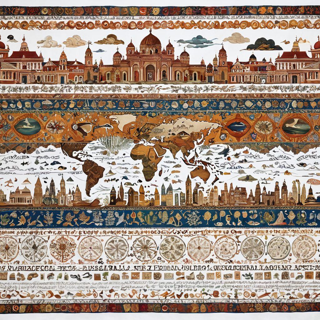
In a world where stories often fade into the background, data visualization emerges as a powerful tool to breathe life into historical narratives. Imagine peeling back the layers of time to uncover the riches of our past, transforming dry statistics about wars, trade, or cultural shifts into vivid visual representations. What if we could walk hand in hand with historians and archaeologists, navigating the intricate paths of our heritage without getting lost in the chaos of information? Data visualization not only captivates the imagination but also captures the essence of human memories, allowing us to reconnect with our collective cultural history.
When we think about the past, we often rely on traditional historical documentation filled with dates and narratives that can feel overwhelming. Yet, what if we could turn those dense paragraphs into a series of visually engaging histograms and artistic graphs that tell a story? For example, a historical timeline could seamlessly track the rise and fall of civilizations, offering not just data points but compelling anecdotes that draw the viewer in. Just as a story blends characters, conflicts, and resolutions, data visualization allows us to chronicle past events in a way that resonates with our modern sensibilities. After all, who wouldn't rather see the evolution of a culture laid out before them with colors and shapes rather than buried beneath layers of text?
At the intersection of data and historical analysis lies the essence of historicity. Historians, equipped with an array of tools, perform the delicate dance of sifting through records to extract meaningful insights. Why not visualize this process? Consider the impact of a well-crafted timeline visualization that references archaeological records, creating a time capsule of human interaction and innovation through centuries. Each data point stands as an artifacts that have shaped our identity, and through visuals, we can illustrate the dynamic evolution of ideas, beliefs, and customs of various cultures.
Furthermore, delving into cultural history through the lens of data opens doors to fascinating conversations. Picture an exhibit that juxtaposes population growth against economic turbulence, decorating the walls with stunning graphs that tell of resilience and adaptation. Such visual narratives not only make history more engaging but invite questions that linger in our minds long after we've left the exhibit. Who were the key figures that shaped those moments? What were the social dynamics at play? By sparking these inquiries, we deepen our understanding and appreciation of the past, forging connections between personal experiences and collective histories.
Ultimately, the beauty of data visualization lies in its ability to democratize history. No longer relegated to dusty books or university lectures, historical narratives can resonate with anyone willing to explore them. By transforming complex data into relatable graphics, we empower individuals to take part in their heritage actively. Whether you're a casual observer or a dedicated historian, engaging with data visualizations presents opportunities to not just learn about the past but to become storytellers yourself. Why wait? Dive into the wealth of historical analysis available and discover the vibrant tales waiting to be unveiled at the confluence of art and information.